How to identify bearish patterns
Bearish chart patterns give you valuable clues about where the market might be headed next. In this article, we’ll show you how to spot a bearish pattern and turn it to your advantage - especially when you're facing a trading challenge.
What are bearish patterns?
Bearish patterns are every technical trader’s best friend. Why? Because these specific groupings of candlesticks help predict when the market price might drop. Depending on how many candlesticks are involved in chart patterns, we talk about bearish patterns (single or few candlesticks) or bearish chart patterns (more complex formations). Both serve as a solid foundation for building advanced trading strategies.
But here’s the thing – bearish patterns work best when combined with other technical indicators like the MACD. Think of them as confirmations. When your technical indicator hints at a bearish shift and you spot a bearish pattern forming, you’ve got a strong signal.
That said, markets are wild and unpredictable. No pattern, no matter how perfect, offers 100% certainty. So stay sharp, stay flexible, and always manage your risk like a pro.
Top 3 bearish patterns
Evening star pattern
The Evening Star is a classic bearish pattern made up of three candles, signaling a potential reversal from bullish to bearish. You’ll usually spot this pattern at the top of an uptrend, where it hints that the bulls might be losing steam and the bears are ready to take over. When you see an Evening Star on a D1 (daily) timeframe, it’s considered a strong sign that the trend might be shifting.
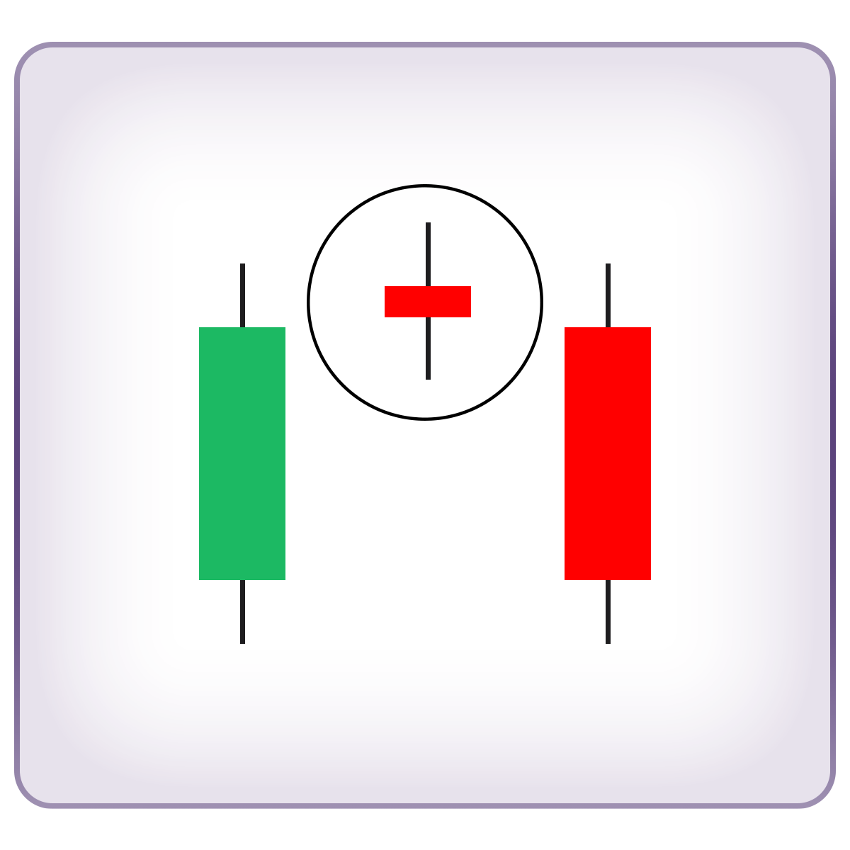
Here’s how to read it:
- First Candle (Strong Bullish): this large green candle shows that buyers are in full control, pushing prices higher with strong momentum. The bulls are confident, and the buying pressure is intense.
- Second Candle (Indecision): a much smaller candle follows, showing that the bulls are starting to hesitate. The market is becoming more balanced as bears begin to step in. This pause can be triggered by an overbought market, news from the economic calendar, or psychological resistance at key price levels.
- Third Candle (Bearish Takeover): the first red candle in this bearish pattern opens lower than the close of the second candle. This is the bears making their move: “We’ve got control now!” The strong selling pressure drives prices down sharply, often triggering a full-on trend reversal.
Three black crows
Whenever you hear about Three Black Crows, it’s time to brace yourself—this is one of the strongest bearish patterns out there, signaling that the market might be ready to dive. Similar to the Evening Star, this bearish chart pattern predicts that an uptrend is losing steam and a downtrend is about to take flight (or, well, fall).
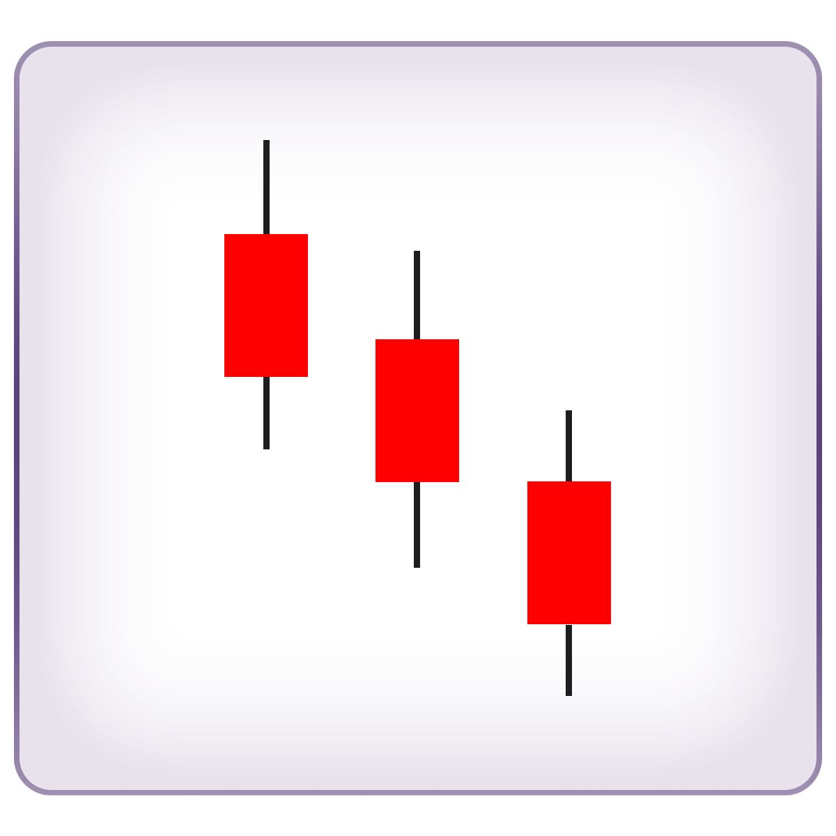
The Three Black Crows bearish pattern is made up of three consecutive long-bodied red candlesticks (the crows). Here’s what makes it stand out:
- Each candle opens within the body of the previous one and closes lower than the last. This shows a steady, relentless push from the bears.
- Minimal or no lower shadows on the candles mean the bears are in total control, dragging the price down without giving bulls much of a chance to fight back.
You’ll usually spot this pattern at the end of a bullish trend, but it can also appear after a period of consolidation. Just bear in mind (pun intended) that Three Black Crows forming right after consolidation isn’t as strong as when they show up at the top of an uptrend. Still, it’s a solid warning sign that the market mood is shifting, and it’s time to get your bearish strategies ready.
Bearish engulfing
This bearish pattern is simple but powerful, formed by just two candles. First, you’ve got a smaller green (bullish) candle, followed by a much larger red (bearish) candle that completely engulfs it – hence the name Bearish Engulfing. This pattern is a strong signal that the uptrend is running out of steam and a reversal might be just around the corner.
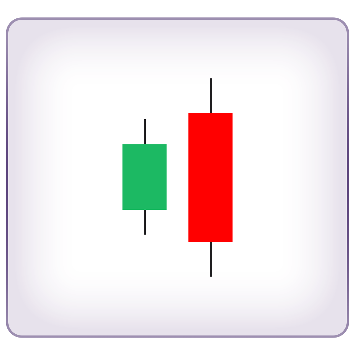
Here’s what’s happening:
- First Candle (Bullish Optimism): the smaller green candle reflects buyers’ optimism. They’re still pushing prices up, but their strength is fading. This could be due to hitting a key resistance level, overbought market conditions, or external factors like economic news.
- Second Candle (Bearish Takeover): the larger red candle shows a drastic shift in market sentiment. Buyers’ enthusiasm gets completely overpowered by aggressive selling. The fact that this bearish candle fully engulfs the first one suggests that sellers are charging in with way more force than the bulls can handle.
Top 3 bearish chart patterns
The main difference between bearish patterns and bearish chart patterns comes down to the number of candles involved. Bearish patterns usually consist of just one or two candles, making them quick to spot but sometimes less reliable. On the other hand, bearish chart patterns are made up of several candles, meaning they take more time to form – but that extra time often translates to stronger, more reliable signals.
Bearish flag pattern
So far, we’ve focused on bearish reversal patterns – signals that the market trend might flip. But the bearish flag pattern is a continuation pattern, meaning when this bearish pattern appears, there’s a strong chance the downtrend will keep going after a brief pause or correction.
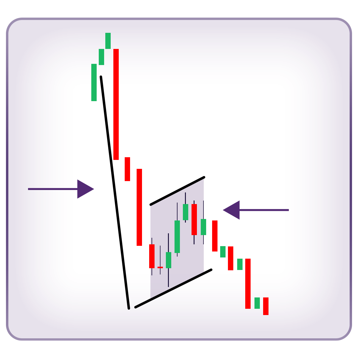
So what does a bearish flag look like? This bearish chart pattern stands out because it literally looks like a flag on a flagpole.
- Flagpole: A sharp, strong downward price move.
- Flag: A brief consolidation phase, typically a small rectangle that slopes slightly upward – against the prevailing downtrend. The flag is much smaller compared to the flagpole, showing that the correction is just a blip before the trend resumes.
Flag patterns are all about market psychology. They start with aggressive moves that catch the other side off guard. In the case of bearish flags, here’s how it plays out:
- The Breakdown: Bears drive the price sharply lower, blindsiding complacent bulls. This creates panic, forcing some bulls to sell while others stubbornly add to their long positions, hoping for a bounce.
- The Trap: After the price bottoms out, bulls regain a bit of confidence during the flag’s consolidation phase, thinking the worst is over. But nope – the breakdown resumes, trapping those hopeful buyers and triggering more long liquidations.
- The Aftershock: Since many bulls from the initial flagpole drop are still trapped, the second breakdown through the flag can be even more intense, leading to a steeper, more severe price drop. Beginning of the second decline, right after the flag is completed, is an ideal entry point.
In short, the bearish flag pattern tells us that while bulls might try to fight back, the bears are still running the show – and they’re not done yet.
Bearish pennant pattern
The bearish pennant is a lot like the bearish flag, but with one key difference: the shape of the consolidation. Both bearish chart patterns form after a sharp, rapid price drop where the bears dominate the bulls. But while the bearish flag forms a rectangular consolidation, the bearish pennant creates a tiny symmetrical triangle.
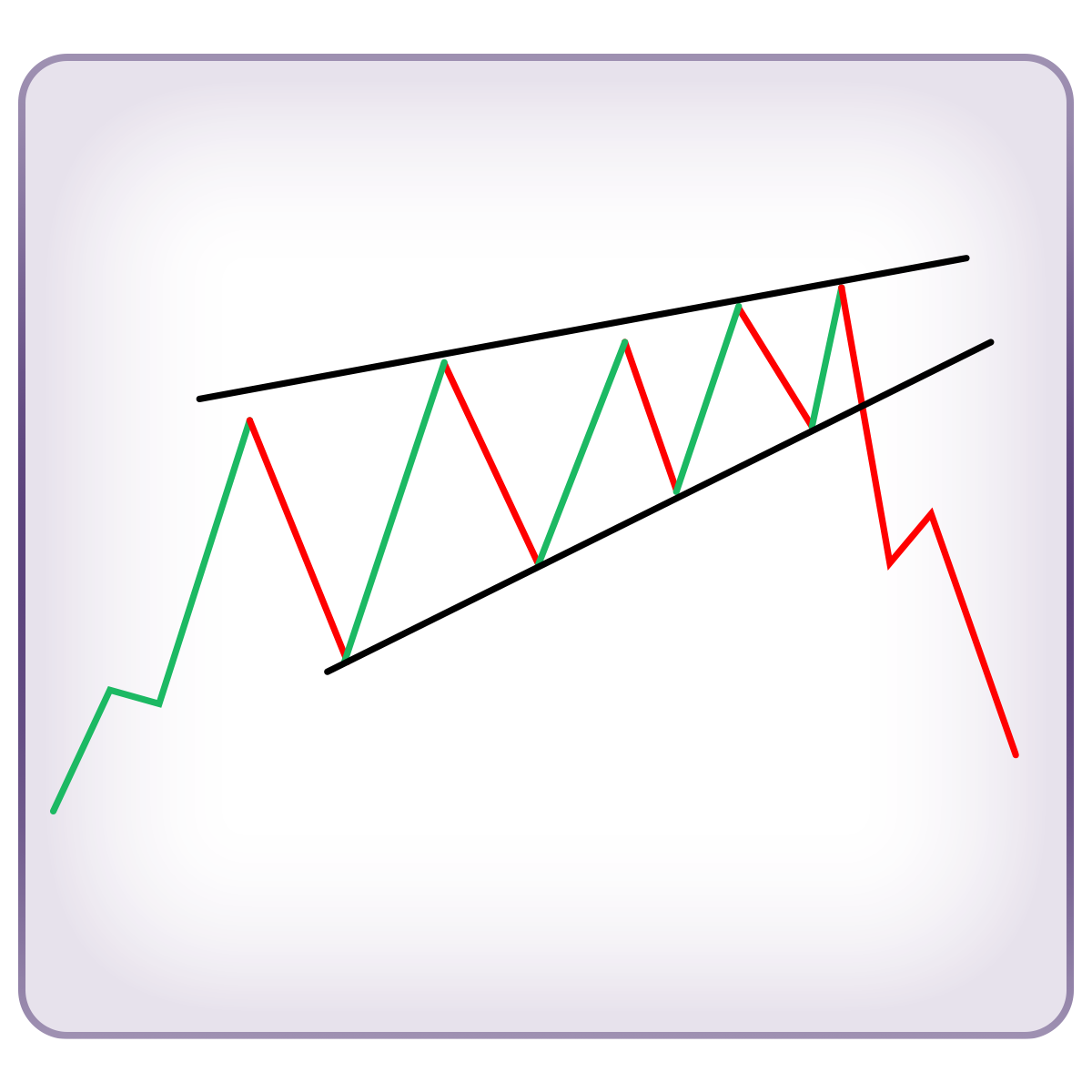
This bearish chart pattern is perfect for shorting. The best entry point? Right at the bottom of the pennant, just as the price breaks down. Since the consolidation is short and tight, the breakout tends to be quick and powerful, making it an ideal setup for traders looking to ride the momentum down.